CORE
For the sake of not repeating myself I’m going to refer to the phrase “code once, run everywhere” as CORE from here on in. Who knows, maybe it’ll catch on. And on to the blog post…
So as you may have heard by now, I’ll be starting my new job as an Appcelerator platform evangelist on Monday. If you’ve read some of my past blog posts, you’ve probably noted that I’ve been pretty critical of cross platform mobile solutions. From a developer’s perspective, we are expecting the coveted CORE, but are often left wanting.
What you’ll quickly find in the world of mobile development is that cross platform does not always equal CORE.
Rather than bemoan the shortcomings of each mobile framework, I’d rather talk about something I heard say during the Appcelerator online training videos. He stated that Appcelerator does not aim to be a CORE technology, but instead a “code once, adapt everywhere” one. Not quite as sexy, but perhaps an even more intriguing philosophy. Let’s discuss why.
Web Based vs. Appcelerator
For a quick summary of how Appcelerator is fundamentally different than web-based cross platform mobile frameworks, read here.
Aside from near-native performance, what’s the biggest advantage of using Appcelerator over web based mobile frameworks like Phonegap or Rhomobile? Its ability to use the device’s native UI components. And no, I don’t mean it has UI components skinned to look like native components, like many of the web-based solutions. I mean it actually uses the platform’s native, performant UI in the app.
With native UI we can build apps that are indistinguishable from apps built with Objective-C or Java. The look, feel, performance, and behavior will be exactly what is expected of the given platform. Plus, we don’t have to build them ourselves.
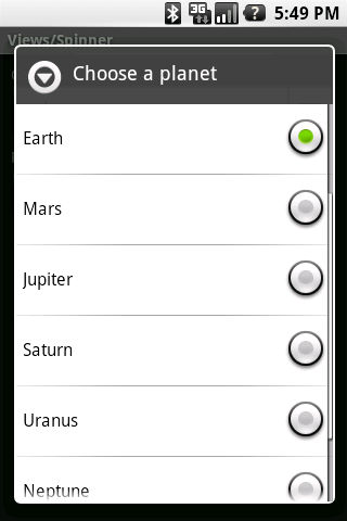
To achieve this level of quality, though, you need to be willing to adapt your app, not just design for the lowest common denominator, as is often the mentality with CORE apps. Sure, you can use the iPhone’s slick Navigation Controller bar on all versions of your app, but is that what Android users are expecting? Nor would an Android Spinner be befitting of an iPhone app.
You see, in some cases, CORE apps come at the expense of the most important factor: the user experience.
Why Bother?
Many people, particularly proponents of web based mobile development, are of the opinion that native UI components are not necessary to deliver a high quality user experience. I agree, in certain circumstances. Games, novelty utilities (think Flashlight), and otherwise simple apps are good examples that probably don’t benefit much from a native experience.
In my opinion, though, it’s a necessity for more complex apps, particularly ones leveraging native APIs, to use the UI that is familiar to the device. They need to work in a simple, intuitive manner as mobile users can be quick on the trigger in deeming an app unfriendly. Those who have spent time developing for multiple platforms understand that the users of each platform have different expectations.
I don’t want a navigation bar in my Android app. I want my tabs at the bottom on iPhone, the top on Android. I want to press my menu button on Android to get my app’s options. I want my system buttons to look familiar. I want to pull to refresh on my iPhone.
Let me be clear that both Appcelerator and web-based frameworks have the ability to adapt their apps to supported platforms. And I don’t just mean churning out a basic app, I mean creating a high quality, native app. Depending on your point of view, however, one may be much more appealing than the other.
Attending to the UI (Web-based)
With web-based solutions, the app exists in a web view container. This means that you are effectively building a native app that consists of only a web view which hosts a web application. You have no native components with which to work. This leaves us with 2 options for building the UI of the app (super quick assessment coming):
- Use a 3rd party framework like jQuery Mobile or Sencha Touch
- Pros
- Lots of functionality and UI components
- Speeds up development process
- Some, like Sencha Touch, have a very native look to their components.
- Cons
- Web based framework UI is generally less responsive than ones created natively or with Appcelerator on mobile devices.
- Additional learning curve for the added framework
- You are even further removed from the native app. You now have a UI framework which sits on a native web view wrapper which then becomes a native app. Lots to know and lots of places for things to go wrong.
- Frameworks like Sencha Touch are limited to webkit based web views (iOS, Android, BB 6.0+). This essentially removes the biggest advantage of web based frameworks, which is their compatibility.
- Create the UI yourself with HTML/CSS/JS
- Pros
- Totally customizable for any platform
- Its easier to manage performance and UI inconsistencies when using code for only what you need to achieve
- No additional learning curve beyond basic web dev and understanding your web based framework of choice.
- Cons
- Much slower to develop, as you have to build your UI from scratch. The styling of the UI to look native all falls on you or external resources you can find.
- Even for seasoned web devs, managing cross platform mobile CSS can be a daunting task.
- All cross browser inconsistencies become your job to address, unless you use a light JS framework like xuijs or zeptojs.
So as you can see, web based mobile development encounters many of the same issues that traditional web development does. And the problem is compounded when you are trying to make these web based solutions look, feel, perform, and behave natively.
Attending to the UI (Appcelerator)
Appcelerator apps are built differently. The extremely short version is that Appcelerator Javascript code is mapped to native symbols of the target platform. Any code that can’t be mapped to a native symbol is run through a Javascript interpreter. , CEO of Appcelerator, does a much better job of explaining it in this StackOverflow post.
What this means that there are no 3rd party tools or special code necessary to create totally native components. You want a button that has native appearance and behavior on both iPhone and Android?
var button = Ti.UI.createButton({title:'test button'});
There you go, an Android and iPhone button respectively. How ’bout a table view populated with sample data?
var data = [{title:"Row 1"},{title:"Row 2"},{title:"Row 3"},{title:"Row 4"},{title:"Row 5"},{title:"Row 6"}];
var table = Titanium.UI.createTableView({data:data});
Yep, it’s that simple. The iPhone table will even have the bounce scrolling users expect. You have the same simplicity that web based UI frameworks solutions provide, except you are additionally getting native look, feel, performance, and behavior. The components are even designable as you would expect them to be.
The one drawback to this simplicity is that without careful attention to your code, you can end up with a mess of interlacing UI and logic. Android has XML for layout, iOS has .nib/.xib files, web based solutions have HTML/CSS. Appcelerator, for the time being, relies solely on your Javascript code. Javascript MVC frameworks, like PureMVC, and attention to best practices (as mentioned in the online training videos) can mitigate this risk. There are even some vague rumblings of a more declarative syntax for UI design in the future…
Adaptation
So now that we know how UIs are built in both Appcelerator and web-based frameworks, how do we adapt them in such a way to deliver a native user experience? Despite the differences between the frameworks mentioned so far, the solution is fairly common among all frameworks.
While I will confidently say that Appcelerator has the abstraction that delivers the most familiar and device-specific experience, it too needs to account for usability that is not necessarily CORE. And even saying it is not CORE can be a bit of a misnomer as the same code base can be used by multiple platforms. It just requires the clever and judicious insertion of platform specific code facilitated by your mobile framework’s device identification APIs.
Let’s take a quick look at how Appcelerator identifies your device and can act on the information:
var osname = Titanium.Platform.osname;
if (osname == 'android') {
    // android specific code
} else if (osname == 'iphone') {
    // iphone specific code
} else if (osname == 'ipad') {
    // ipad specific code
}
For a more in depth example of how you can use this logic to create truly cross platform components and functionality, check out the 6 minute screencast “Forging Titanium: A Cross-Platform Navigation Controller.” Or just watch this:
And for reference, let’s look at PhoneGap’s adaptation method as well, just to show the similarities:
var platform = device.platform;
if platform == 'Android') {
    // android specific code
} else if platform == 'iPhone') {
    // iphone specific code
} else if platform == 'BlackBerry') {
    // blackberry specific code
}
Very similar indeed, but you need to consider the 2 prior “Attending to the UI” sections before calling them equal. Its the frequency with which you are required to apply this and other types of adaptation that affects the maintainability of your app as it grows.
Minimizing Adaptation
It doesn’t take an expert software engineer to see that conditional checks on the device’s platform throughout your code isn’t ideal. It gets harder to maintain the more conditionals you include. It becomes apparent that we need our development framework to do most of this work for us.
In the case of Appcelerator, the need for conditional adaptation is minimized by the fact that you can utilize native UI components. Look back at our examples of the buttons and table views. There was no conditional code, no special handling. You get system specific components with no extra effort.
You really only need conditional code when you want to leverage native components that don’t have an equivalent on your other target platforms. For example, if you haven’t already, check out the Cross-Platform Navigation Controller video above. It shows how you can use these conditionals to create navigation code that you can use seamlessly between iOS or Android.
Web based platforms also do a great job of creating an abstraction so that you don’t need to use conditionals for each supported platform. The problem, as discussed earlier, is that these abstractions don’t represent actual native components. They most often represent HTML/CSS/JS that are attempting to mimic native components. Worse yet, sometimes they are components that have no relation to existing native components, yet find themselves in native apps. As I said, this is a point of contention among mobile developers, and I’ll leave further discussion for the comments if necessary.
What web based frameworks can’t give you in native components, they provide in CSS, often applied dynamically via Javascript. The use of CSS is a double-edged sword. On one hand, you have a method of styling that not only allows you to skin your whole app, but also affords you the opportunity to gracefully degrade the styling based on the user’s device. This is why web based solutions typically support more platforms than ones like Appcelerator. Add all the bells and whistles like rounded corners, drop shadows, webkit transitions, etc… and if the device doesn’t support them, they will disappear without interrupting the user experience.
On the other hand, unless you are a CSS wizard with existing knowledge of CSS3 and how it applies to mobile, using it can be difficult. You can find yourself with mountains of CSS attempting to mimic components that are created with a single line of code in Appcelerator. For example, here’s a shiny iPhone button in pure CSS:
input[type=button] {
  font-family: "Helvetica Neue", Helvetica, sans-serif;
  font-size: 1.3em;
  font-weight: bold;
  width: 97%;
  height: 50px;
  border: 3px solid #282726;
  background: -webkit-gradient( linear, left top, left bottom, from(#e2e2e2), to(#8c8a88), color-stop(0.5, #acadae), color-stop(0.5, #82807e) );
  margin: 0 0 3px 0;
  text-shadow: 0px 1px 0 #cecece;
  -webkit-background-origin: padding-box;
  -webkit-background-clip: border-box;
  -webkit-border-radius: 8px;
}

input[type=button]:hover, input[type=button].cancel,
input[type=button]:active, input[type=button].cancel:active {
  color: #fff;
  text-shadow: none;
}

input[type=button]:hover, input[type=button].cancel:hover {
  background: -webkit-gradient( linear, left top, left bottom, from(#aaaee5), to(#10006d), color-stop(0.5, #1F3B97), color-stop(0.5, #081f6f) );
}

input[type=button].cancel {
  background: -webkit-gradient( linear, left top, left bottom, from(#5c5c5b), to(#1e1b16), color-stop(0.2, #1e1b16) );
  margin-top: 6px;
}
It does the job, but man, it is really cumbersome. Again, this is all a factor of wanting to create a native experience. Some will contest that it does not need to be this complex, that as long as the UI is uniform it does not need to conform to the native expectations. This mentality, though, is typically only held by those who back mobile frameworks that are incapable of delivering that native experience. As the local radio sports caster in Pittsburgh likes to say, “Not hatin’, just sayin’.”
Summary
You can’t beat web based mobile development for platform compatibility. Every mobile device has a browser that supports HTML/CSS/JS, right? You can create UIs that work on many platforms and degrade gracefully to handle lower end devices. Quality, usable apps are totally possible with these frameworks.
But the user doesn’t care how compatible your app is. They just want it to work, as they expect it to, on the device of their choice. In this respect, Appcelerator is unparalleled in the realm of cross platform solutions.
I have a strong suspicion that web based mobile technologies are only going to get better. I mean, let’s face it, the web isn’t going to be disappearing anytime soon. It will get faster, more functional, and closer to the expectations of the mobile user, just like desktop web browsers. And I, as a soon-to-be Appcelerator employee, welcome this.
As web based mobile development ups it game, so shall Appcelerator. Whether you’re an Appcelerator, web based, or native developer, it’s an exciting time… no matter what side of the fence you’re on.

![]()


